
Data visualization is a technique for representing complex information in an intuitively understandable form using graphs and charts. It is an essential technology for clearly visualizing vast amounts of data and is utilized in various business scenarios.
This article provides a comprehensive explanation of data visualization, covering its basic overview, benefits, specific examples, and practical implementation methods. If your company is considering utilizing data, please read through to the end.
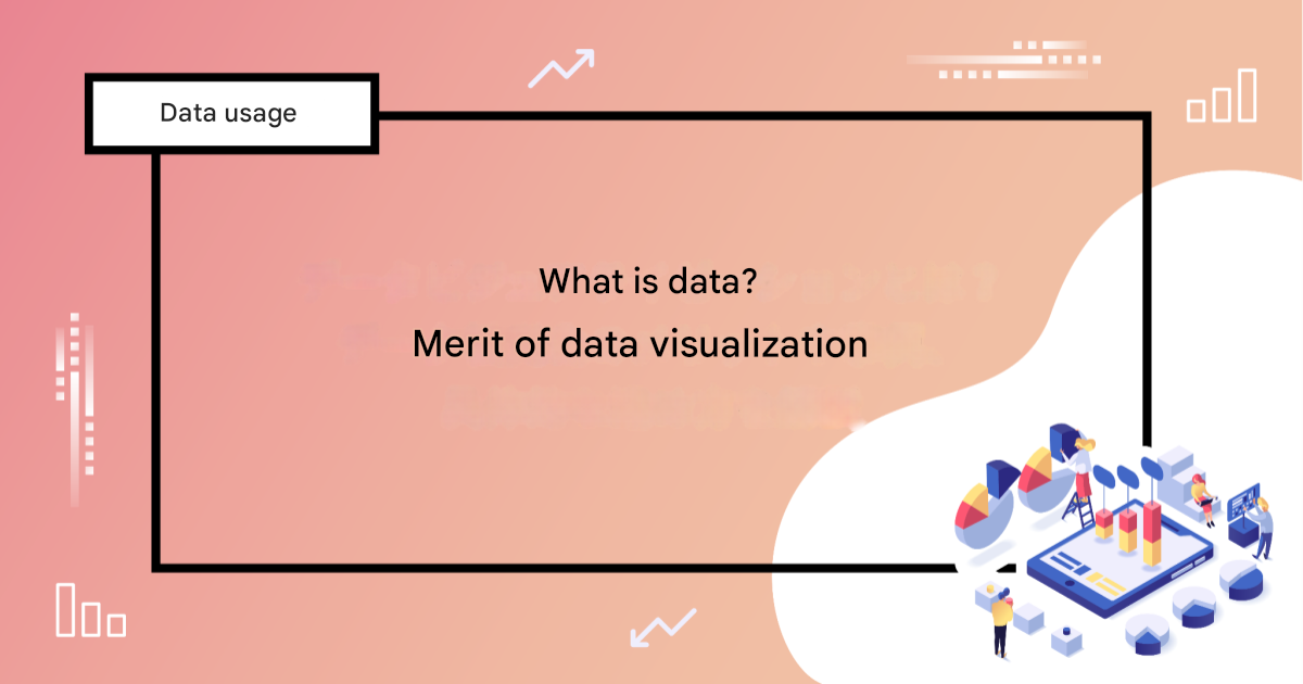
What is Data Visualization?
Data visualization is a technique for visualizing vast amounts of data, such as numbers and text, and presenting it in an easily understandable format. By visually capturing trends, patterns, and anomalies that are difficult to see when just reading the data itself, it leads to more efficient analysis and decision-making.
For example, representing sales data with a bar chart allows you to grasp growth trends or periods of decline at a glance. Furthermore, visualizing complex relationships between data points can lead to new discoveries and valuable insights.
In this way, data visualization can be considered a highly effective method for companies aiming to achieve growth.
The Importance of Data Visualization
In recent years, rapid advancements in information technology have led to an explosive increase in the volume and diversity of data held by companies. Consequently, extracting useful information from this vast and varied data is extremely challenging. Simply looking at the raw data does not lead to its effective utilization.
In this context, data visualization makes it possible to efficiently derive value from massive datasets. By visually organizing complex data, it can be transformed into a form that anyone can understand intuitively, leading to faster and more accurate decision-making.
Furthermore, visual data representation has the effect of making information more memorable, making it an effective means of conveying impactful messages to decision-makers and customers. Thus, data visualization is a crucial element for enhancing a company’s competitiveness in today’s data-driven society.
Types of Data Visualization
Data visualization can be broadly divided into two categories. This chapter explains these types.
In the Field of Science and Technology
In science and technology, data visualization plays a role in visualizing vast and complex numerical data or simulation results to support analysis and discovery. For example, weather forecast maps created from meteorological data and 3D models in medical image analysis are used by experts to efficiently understand information and make highly accurate judgments.
Additionally, visually representing massive computational results, such as particle movements or space simulations, helps elucidate phenomena that are not visible to the naked eye. In this way, data visualization in science and technology significantly contributes to the deepening of scientific knowledge.
In the Field of Information Technology
In information technology, data visualization is used as a method to understand system status and business data, supporting efficient decision-making. Examples include visualizing website traffic and user behavior, as well as network traffic.
This allows operations staff to immediately identify issues and bottlenecks and respond quickly. Moreover, visualizing sales data and customer data through data visualization enables executives and marketing personnel to formulate precise strategies.
As described, data visualization is utilized in various scenes within the information technology field and has become a key element for companies building a data-driven management foundation.
Benefits of Data Visualization
So far, we have explained the overview of data visualization. What specific benefits can a company gain by utilizing it? This chapter describes three representative benefits of data visualization.
Enables Intuitive Understanding of Data
The greatest benefit of data visualization is its ability to clearly visualize complex data. Using graphs and charts allows for the instantaneous grasp of trends and patterns that are difficult to see in rows of numbers and text. For instance, representing sales data with a line chart enables anyone to intuitively understand seasonal fluctuations and growth trends.
Facilitates Efficient Decision-Making
Data visualization supports efficient human decision-making by quickly extracting key points from vast amounts of information. As a specific example, using a real-time dashboard allows you to check the progress of operations and identify issues at a glance, making it possible to take appropriate action immediately. Furthermore, because visualized information promotes accurate and efficient judgments, it also leads to improved competitiveness in business.
Enhances Smooth Information Sharing Within Teams
Using visual data makes it easier to convey information clearly, even to people without specialized knowledge. Therefore, it is extremely useful for facilitating communication with others, such as during internal presentations or customer negotiations. Organizing complex data and sharing it visually ensures that everyone understands the same information correctly, making it easier to work towards common goals.
Typical Methods of Data Visualization
Even when we say “data visualization,” the methods are diverse. This chapter picks out and introduces several representative methods.
Line Chart
Line charts are ideal for visualizing time-series data and trends. For example, they are used to show monthly sales changes or temperature variations, making it easy to grasp change patterns and seasonal trends. It is also possible to overlay and compare multiple datasets, helping to visually understand the relationships between different elements.
Bar Chart
Bar charts are suitable for comparing data across different categories. For instance, they are used to visualize sales by region or the number of customers by age group, allowing you to see the differences between categories at a glance. A major feature is the wide variety available, such as vertical, horizontal, and stacked types, which can be used depending on the purpose.
Area Chart
Area charts fill the area below a line chart and are suitable for emphasizing proportions or the overall trend of data. For example, area charts are an effective method for showing revenue breakdowns or changes in market share. Using a stacked area chart can also represent the total of multiple elements and their relative changes over time.
Indicator
Indicators are a data visualization method used to highlight specific numerical values. Their characteristic is that they allow for an intuitive grasp of progress status or goal achievement rates through simple meters or numerical displays. Indicators are often used on dashboards and contribute significantly to real-time data monitoring and rapid decision-making.
Scatter Plot
Scatter plots are ideal for showing the relationship or distribution between multiple variables. For example, they are used when analyzing the correlation between advertising spend and sales, or purchasing trends based on customer attributes. By using scatter plots, data trends and anomalies can be captured visually, making them useful as a foundation for statistical analysis.
Map
Maps are used when visualizing geographical data. For example, displaying population distribution, sales figures, or weather data by region on a map allows for an intuitive understanding of spatial patterns and characteristics of each area. In particular, heatmaps and point data overlaid on maps are frequently used in marketing and logistics.
Use Cases for Data Visualization
In what specific situations is data visualization used? This chapter introduces four representative use cases.
Finance Industry
In the finance industry, data visualization is used as a crucial tool for risk management and decision-making. For example, showing stock price trends with line charts allows investors to quickly grasp trends. Additionally, using dashboards to visualize trading data and customer portfolios in real-time helps detect fraudulent transactions and assess market risks.
Manufacturing Industry
In manufacturing, data visualization is used to monitor production processes and equipment operating status. For instance, visualizing production line operating rates and defect rates in real-time enables early problem detection and rapid response. Furthermore, displaying supply chain data on maps or flow diagrams makes it possible to efficiently consider measures for logistics optimization and cost reduction.
Digital Services Industry
In the digital services industry, visualizing user behavior and system performance helps improve services. For example, displaying in-app usage as a heatmap makes it easy to identify frequently used features or areas needing improvement. Also, monitoring server load and error occurrence in real-time enables a quick response when failures occur.
Digital Marketing
In digital marketing, data visualization is effectively used for measuring campaign effectiveness and customer analysis. For example, showing ad clicks and conversion rates with bar charts or line charts allows for an instant grasp of the results of measures. Furthermore, visualizing customer attributes and behavior data in scatter plots or segment charts helps clarify target customer characteristics, leading to the formulation of more effective marketing strategies.
A Practical Example of Data Visualization
A certain IT company visualizes its sales performance data using data visualization techniques.
Previously, the company only stored raw sales performance data in a shared internal folder. Opening the file revealed only rows of numerical performance data for each organization. This made it difficult to determine whether current performance was good or bad, posing a significant challenge due to the effort required for data utilization.
Therefore, the company devised a solution by visualizing the sales performance data using bar charts and line graphs, enabling anyone to understand the situation at a glance. At the same time, they introduced a BI tool to present the data in an easy-to-understand format and placed it on a dashboard accessible to everyone in the organization.
As a result, sales managers could instantly grasp their organization’s achievement rates and issues, allowing them to consider rapid improvement actions. Furthermore, sales team members could also check their individual performance on the dashboard, and the practice of using this information for subsequent decisions became widespread.
Additionally, this dashboard incorporated elements of customer analysis, making it possible to understand sales trends, such as what types of customers are more likely to place orders. As a result of using this information for sales activities, the company was able to use its limited sales resources efficiently, achieving a 130% year-on-year increase in sales.
This is an excellent example of how data visualization can be used to clearly present company data, leading to reduced workload and increased sales.
5 Steps to Implement Data Visualization
To successfully implement data visualization, it is necessary to follow appropriate procedures. Finally, we will explain the steps for practicing data visualization in five stages.
Step 1: Clarify the Objective
First, clarify the objective of your data visualization.
For example,
-
Analyze sales trends to consider the next measures.
-
Visualize product defect rates to identify causes.
Specifically set the goals you want to achieve or the issues you want to solve. Clarifying the objective is a very important process because it allows you to efficiently collect and analyze data aligned with that goal.
Step 2: Collect and Organize Necessary Data
Next, collect the data needed to achieve the objective. If there are multiple data sources, it is important to integrate them and improve data quality by appropriately handling missing values and anomalies. Another key point is to assign priority weights to the data and select which data to use for analysis and visualization.
Step 3: Select the Appropriate Method
Once data collection and organization are complete, select the optimal method for visualizing it. As mentioned earlier, there is a wide variety of visualization methods, so it is necessary to choose appropriately according to your company’s objective.
For example:
-
Time-series data: Line chart
-
Categorical data: Bar chart
-
Geographic information: Map
Choose a method that suits the nature of the data and your purpose.
Step 4: Visualize the Data
After selecting the data visualization method, proceed to actually visualize the data. While it is possible to do this manually using Excel, utilizing a BI tool (a tool for clearly analyzing and visualizing data) allows you to work more efficiently. Today, there are various BI tools on the market, such as Tableau and Power BI, so it is advisable to positively consider introducing one that matches your company’s objectives.
Step 5: Implement the PDCA Cycle
It is recommended to immediately share the data visualized through data visualization with the team and relevant parties and receive feedback. This is because discussing the visualized data can lead to new ideas and points for improvement.
Furthermore, by periodically evaluating the effectiveness of the visualization and making updates or corrections as needed, you can further enhance its accuracy. By continuously running this PDCA cycle, you can maximize the effectiveness of data visualization, ultimately leading to your company’s business growth.
Conclusion
This article has explained the basic overview and benefits of data visualization, along with specific examples and practical implementation methods.
By implementing data visualization, companies can enjoy various benefits such as efficient decision-making and smoother information sharing. Re-read this article to solidify your understanding of specific cases and practical approaches.
Follow us on Facebook for updates and exclusive content! Click here: Sada AI